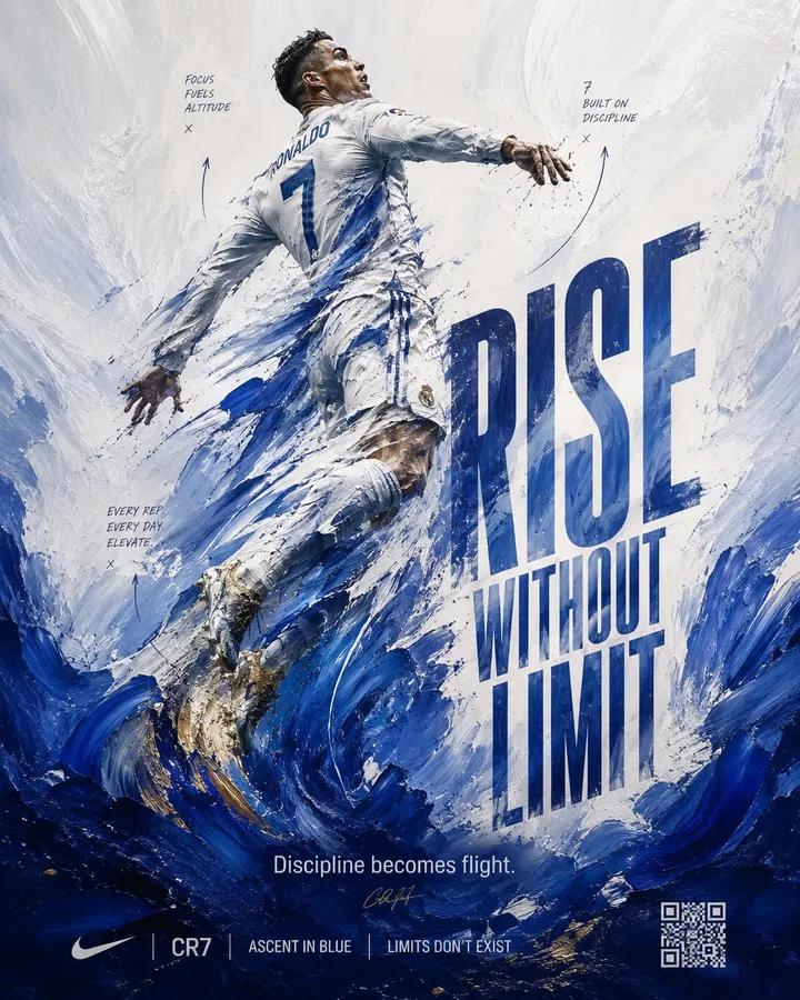
Abstract expressionist sports art poster
Description
A semi-abstract sports poster where the athlete is constructed from thick, soft painted motion fields, using team jersey colors to depict athletic elevation as disciplined force and upward momentum.
Prompt
Design a 4:5 sports art poster for 'ATHELETE_NAME' using realistic, soft, thick painted motion fields, player’s leap translated into directional brush energy, a vertical ascension composition, and an emotional goal of disciplined transcendence and cold precision. CONCEPT: player is not just depicted—he is constructed out of force. His iconic jump is visualized as a surge of realistic paint strokes based on PLAYER’s team jersey colors, rising like a controlled explosion, turning athletic elevation into a visual language of upward pressure, discipline, and momentum. The poster captures the instant where physical power becomes abstract motion. SUBJECT: player rendered as a dominant semi-abstract figure emerging from layered, soft, freshly painted strokes rather than a fully literal photograph. His body is partially defined—recognizable facial structure and torso clarity—but limbs dissolve into sweeping, thick paint gestures, especially around the legs and arms, emphasizing lift and motion. The figure is angled upward, as if still climbing, occupying the central vertical axis but never fully contained. COMPOSITION: A vertical ascension layout where the bottom third is dense with heavy, soft, realistic brush strokes, gradually opening into lighter, more fluid white space toward the top. The eye path starts at thick, grounded painted textures and travels upward through flowing lines and fragmented form into player’s mid-air presence. Negative space at the top acts as a zone of calm highlight contrast against the dense painted energy below. The background behaves like a freshly painted atmosphere, not a flat field, with directional strokes reinforcing upward motion. TYPOGRAPHY: Headline: 'RISE WITHOUT LIMIT' set in a condensed athletic sans-serif brushed text, vertically stretched on the left side, and partially masked by soft paint strokes, as if emerging through layers. The baseline subtly curves upward, following the motion of the brushwork. Subhead: 'Discipline becomes flight.' in a restrained grotesk, placed lower in the composition where the paint is densest, anchoring the concept. Accent microtext appears as thin, almost hand-marked annotations integrated into the brushwork, echoing motion paths rather than sitting as static text. LIGHTING: Painterly lighting logic rather than photographic realism—high-contrast highlights use the lightest jersey color or white painted strokes to simulate directional light, while darker jersey tones create shadow depth. The figure’s defined areas receive subtle, controlled highlights to maintain legibility within abstraction. COLORS: Dominant palette based on PLAYER’s current or most iconic team jersey colors. Use the primary jersey color as the anchor, the secondary jersey color as the main motion accent, and white or the lightest jersey tone for highlights and negative-space contrast. Shadows should lean into the darkest available jersey color or a deepened version of the primary team color. Supporting tones may include softened, desaturated transitions derived from the jersey palette only. The overall palette must feel customized to the player’s team identity while preserving clarity, control, and intensity. STYLE: Abstract expressionist sports art fused with disciplined athletic branding; realistic painterly motion meets precision performance. The style feels like a gallery-worthy sports portrait, balancing soft, thick brush energy with controlled composition. FINISH: Visible realistic brush textures with layered paint depth, soft thick impasto effect in dense areas, and smoother, freshly diluted strokes in upper regions. No digital gloss—finish leans tactile and artistic, with gentle edge feathering where paint dissolves into negative space. No unnecessary overlays or artificial effects. FOOTER: A minimal, integrated footer carved into the lower paint mass, using small uppercase sans-serif text