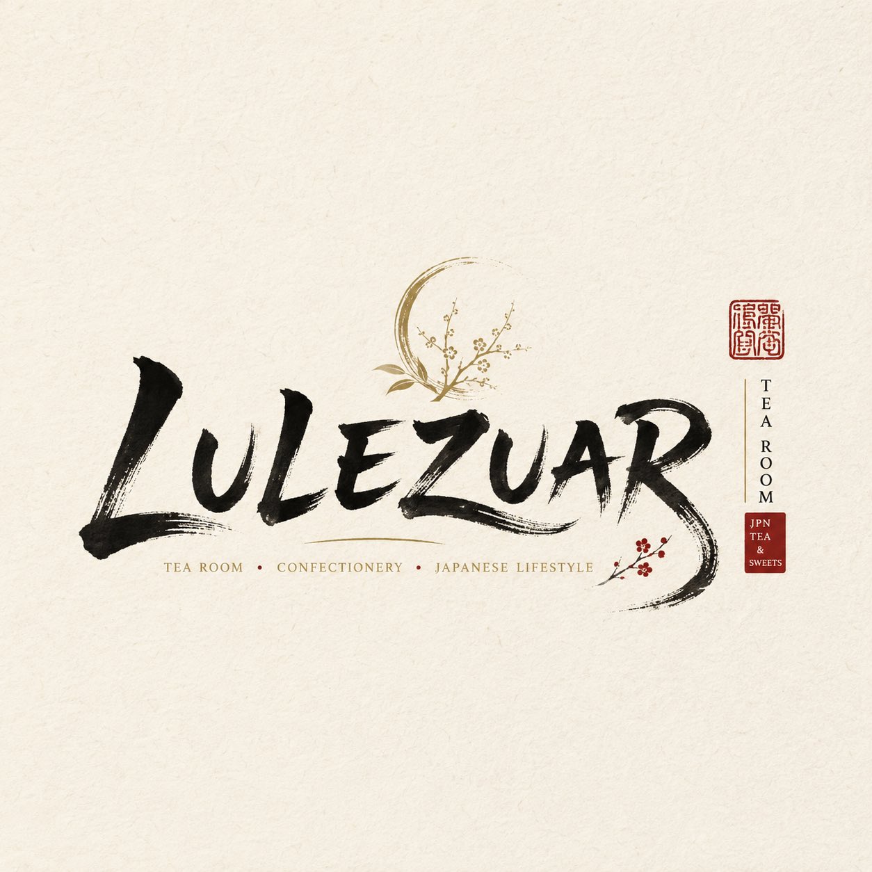
Handwritten English Shop Logo Design
Description
A set of four high-completion handwritten storefront logos suitable for commercial use, inspired by Japanese-style signage aesthetics.
Prompt
Prompt: Design a high-completion 'handwritten English shop logo'. The goal is a commercially usable store logo. ━━━━━━━━ Customizable Content (fill in as needed) ━━━━━━━━ Brand Name / Project Name:【e.g., Lulezuar / Kilig / Saoirse/Wilderness】 Type / Industry:【e.g., Japanese restaurant / izakaya / tea & confectionery shop / wafu lifestyle brand】 Brand Positioning:【e.g., high-end refined / everyday approachable / artistic niche / old neighborhood shop】 Core Keywords:【e.g., wabi-sabi / warmth / antique / crisp / craftsmanship】 Mood:【e.g., calm introverted / lively bustle / serene Zen chic / rugged bold】 Layout Direction:【e.g., horizontal primary / vertical primary / mixed / centered symmetrical】 Main Color:【e.g., ink black / vermilion / navy / off-white】 Accent Color:【e.g., smoky gray / gold / dark red / negative space】 Aspect Ratio:【e.g., 1:1 / 16:9 / 3:4 / 2:1】 ━━━━━━━━ Style Settings (fixed, not recommended to change) ─━━━━━━━━ 【Core Style】 Centered on a brush-pen feel, overall presenting a Japanese shop / storefront sign style. The final effect should look like a real Japanese restaurant, izakaya, tea & confectionery shop, diner, or wafu lifestyle brand. A highly recognizable commercial wordmark that can be used directly. 【Main Text Stroke】 Strokes have clear variation in thickness, reflecting the brush's pressure and rhythm. Retain slight fly-away ink effects, presenting a natural ink feel and breathing sensation. Stroke flow is natural and smooth, not stiff, and does not deliberately imitate printed type. Key strokes can be moderately exaggerated to form visual memory points. Characters do not need to be perfectly regular; allow natural deformation and individual personality. Maintain clear legibility and strong recognition. 【Decorative Elements (used sparingly)】 Small red stamp (seal style) Small vertical explanatory text Small amount of kana / pinyin / English subtitle Red background with white text color block accents 【Composition and Background】 Keep the background clean and simple, with the main wordmark clearly prominent. Overall composition is compact, with the visual tension of a storefront sign. Generate four images.