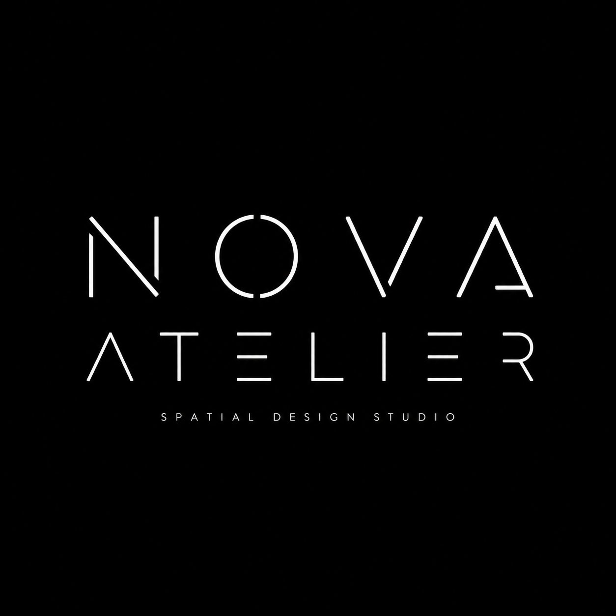
Premium Monoline Constructed Wordmark Logo
Description
A minimalist, architectural monoline wordmark logo designed for a premium brand identity. Clean geometry, deliberate gaps, and subtle negative space create a calm, modern mark.
Prompt
Create a high-end Monoline Constructed Wordmark Logo for: Brand name: [BRAND NAME] Subtitle: [SUBTITLE] Industry: [INDUSTRY] Positioning: [BRAND POSITIONING] Keywords: [KEYWORDS] Mood: [MOOD] Color palette: [MAIN COLOR + SUPPORTING COLOR] Aspect ratio: 1:1 Design a true brand logo, not a poster or decorative typography. The wordmark should be built with a unified monoline stroke width, minimalist letter structure, deliberate gaps, clean connections, subtle negative space, and refined geometric rhythm. The logo should feel modern, calm, restrained, architectural, and highly designed. Keep the main wordmark large, clear, centered, and directly reusable as a brand mark. Use a clean minimal background. Avoid extra icons, heavy decoration, complex textures, loud effects, or proposal-board clutter. The final result should look like a premium, reusable monoline wordmark logo with strong structure and clear brand identity.