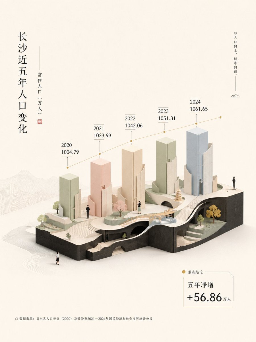
Quiet Geometric Information Landscape Design
Description
A visual system that transforms data and narrative into a spatial, airy composition using geometric objects, restrained colors, and editorial layout for clear information hierarchy.
Prompt
Based on the input content, create an informational visual image with a high-end editorial design sensibility. It is not an ordinary chart or a templated infographic, but rather a transformation of information, data, opinions, text, and emotions into a bright, restrained, spatial miniature landscape. Before creating the visual, first determine the source of the information. If the input already contains tables, screenshots, reports, images, textual materials, or explicit data, prioritize using these materials and extract the structures most suitable for visualization. If only a theme, year, industry, problem, or direction is provided without sufficient data, first conduct an online search and cross-verify. Any information involving the current year, future years, market changes, platform trends, prices, policies, rankings, people, organizations, brands, news, or anything that may change over time must not be fabricated. If unable to connect to the internet or obtain reliable materials, first request supplementary information. The image can be poetic, but the data must be honest. Transform the information into a set of geometric objects that can be seen: cubes, slender pillars, thin sheets, cut planes, platforms, containers, boundaries, floating components, folded structures, tiny marks, and spatial hierarchies. Important information can have clearer volume, higher positions, and more stable structures; secondary information can be lighter, lower, and closer to the background; hidden information can be concealed in edges, gaps, folds, shadows, labels, and fine lines. Do not let the image look like a software-generated chart; instead, make it resemble a quietly arranged, slowly grown information landscape. The composition should be based on ample white space. The main subject can be centered or slightly off-center, allowing the blank space to breathe for the image. The image needs a stable but lightweight visual support; it should not be a heavy black mass but rather something like a light-colored structure, a thin platform, a transparent boundary, a floating base, or an abstract vessel. Other information elements appear around it, pass through it, are slightly obscured by it, or extend from its top and bottom. Maintain a slight perspective and sense of volume overall, but do not turn it into realistic 3D rendering; preserve an ambiguous texture between flat illustration, paper print, low-poly blocks, and editorial design. Do not decide the color scheme by listing specific colors, nor use fixed color cards, popular templates, or preset styles. First, generate a set of color relationships unique to this image based on the theme's mood, information density, usage scenario, and white space ratio. The core of color is not selecting a few colors but establishing an order among brightness, saturation, temperature, weight, and distance. The overall effect should be bright, transparent, clean, and airy. The background should support the main subject like a paper surface with light. Colors among subjects should distinguish information hierarchies through light-dark gradation, warm-cool shifts, transparent overlays, area size, and spatial distance. Dark colors should only be used for minimal amounts of text, thin lines, edges, scales, partial shadows, or visual pauses; large areas of darkening are not allowed. Do not make the image dirty, stuffy, or heavy; do not make the colors overly sweet, commercial, fluorescent, or templated. Regenerate an independent color system for each image based on the input content. Text is not a manual but a part of the image structure. Titles, short phrases, numbers, percentages, labels, and annotations should be naturally embedded within geometric shapes, edges, white space, and the flow of gaze. Important text can occupy an independent area of white space, acting like a question, a judgment, or a narration. Secondary text can be arranged along pillars, folds, sides, light shadows, or small components. Text can be vertical, horizontal, offset, edge-aligned, or hovering in any language, but must maintain a sense of breathing. Do not fill the image with text, nor turn text into decorative noise. It should appear when it needs to be seen and recede when no explanation is needed. The image can include a small number of miniature figures. The figures do not need complex expressions; they can simply be standing, observing, carrying, measuring, looking up, passing by, or pausing. Their presence is to give scale to the information and to humanize vast data. Figures can also be simplified into silhouettes, paper cutouts, geometric icons, or extremely small traces of movement. Additionally, symbolic objects can be naturally generated based on the theme, but they must be geometrized, simplified, and quietened; do not turn them into a pile of stock assets. The final image should be suitable for PPT covers, report illustrations, infographics, social media covers, brand visuals, business cards, or knowledge content display. It should be able to carry information while also being a visual object worth pausing to look at. It should have macro-level white space, micro-level details, restrained order, bright airiness, a touch of humor, and an aftertaste that is never fully spoken. Now ask the user to input: theme, core expression, existing text or data, whether online supplementary materials are needed, whether there are reference images, and the intended usage scenario.